The Real Prompts Behind Mohamed Elshamy’s Claude and Useberry Workflow

•
5 min read

Discover the real prompts Mohamed Elshamy used with Claude and Useberry to audit a problem, build prototypes, test them, and improve the winner.
In the webinar I recently recorded with Useberry, I showed how I used Claude and Useberry to move from product friction to a tested and improved design direction in a much shorter cycle.
What made that workflow work was not one simple prompt.
It was a sequence of focused prompts, each with a clear job.
One prompt helped Claude analyze the problem and turn feedback into a structured Product Requirements Document (PRD).
Another turned the directions into live prototypes.
Another set up the Useberry test.
Then came the results-analysis step.
Finally, one more prompt helped improve the winning design based on what users actually did.
That is the part I want to emphasize most. Better AI-supported workflows do not come from vague requests, and they are not as simple as giving AI one task and letting it take over. You still need strong context, clear instructions, and a clear sense of what you want the model to do at each stage.
Let’s go through the prompts I used in this case study and how they worked:
Prompt 1: Turn the problem into something structured
In the first file, I gave Claude the full context. I attached screenshots of the Communication Emails page, explained the product context, shared support-ticket pain points and stakeholder input, and asked Claude to do three things: run a UX audit, create a PRD, and propose three fundamentally different design directions with tradeoffs.
I also explicitly told Claude not to create or modify files yet and to keep all output in the chat. I wanted the first stage to stay focused on thinking, not making.
I was not asking, “Can you redesign this page?” I was asking something closer to, “Here is the problematic experience, here is what users and stakeholders are saying, here is the environment this product lives in, now help me make sense of it and show me three viable paths.”
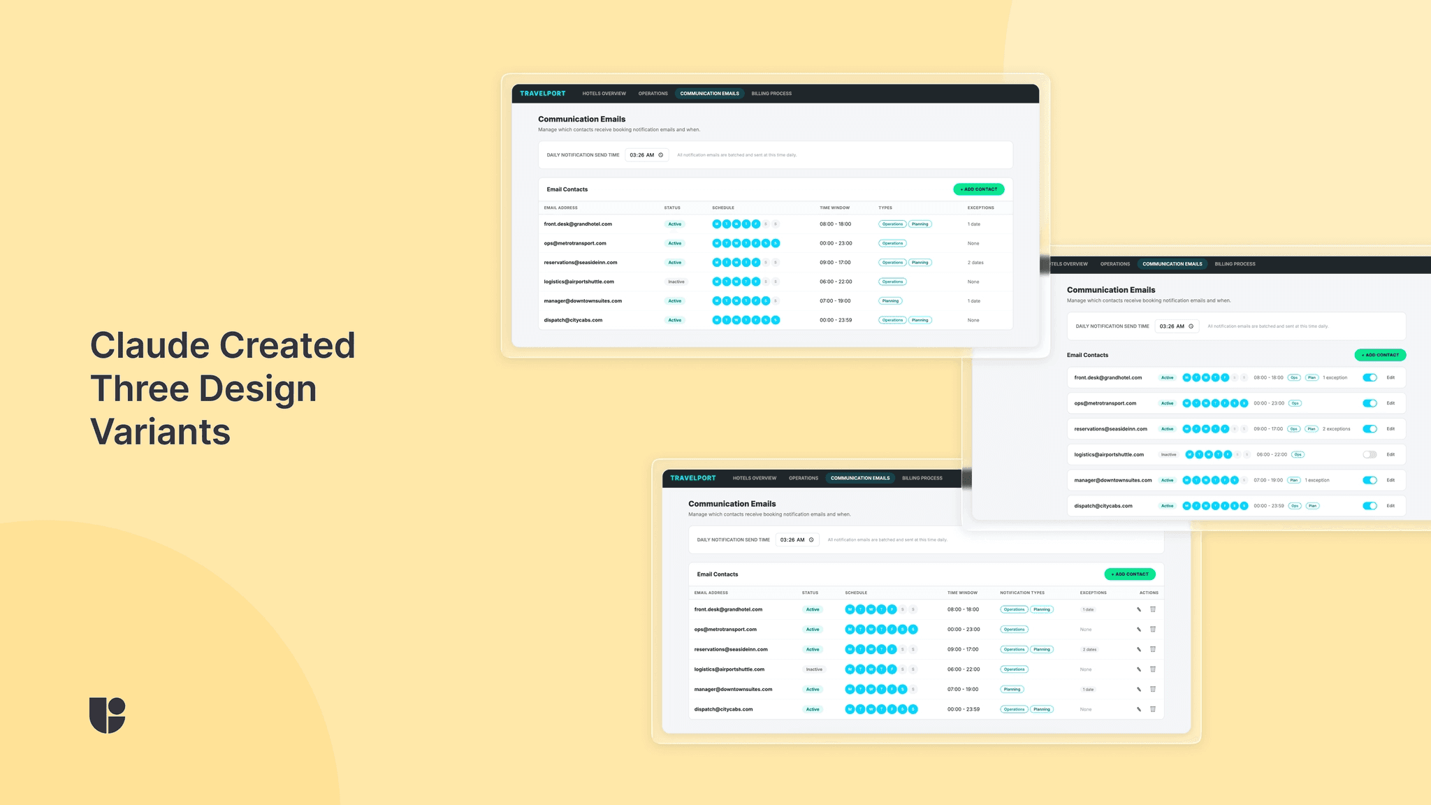
Prompt 2: Build the options fast, then deploy them
Once Claude delivered the PRD and three directions, I asked it to build all three approaches as interactive HTML prototypes.
This file was intentionally strict. I included speed rules like “build fast, don’t polish,” told Claude not to preview or refine the variants, and asked for self-contained HTML files with inline CSS and JS. Then I instructed it to deploy all three to Vercel immediately.
The goal here was not to create production-ready design work. The goal was to produce three testable variants quickly enough that I could learn from them.
Prompt 3: Let Claude set up the Useberry study
This is the prompt where the workflow became especially interesting.
Once the Vercel URLs were ready, I told Claude to set up a usability test in Useberry using Chrome MCP tools. I told it not to create a new project, to work inside the already open project, and to move fast without retrying endlessly.
Then I laid out the exact test structure: a welcome screen, screener questions, three prototype sections with embedded live URLs, a self-report checklist about which tasks participants could find, a final preference question, and a thank-you screen. I also specified recruitment rules, including 10 desktop participants, full-time employed, with a 95%+ approval rate, and asked for recording to be enabled.
Prompt 4: Analyze the results with both data and observations
This is probably the most important prompt in the whole workflow.
At this point, I fed Claude the completed Useberry results, including time on task, task discoverability, overall preference, qualitative feedback, and my own observations from watching the recordings.
The results showed a clear tension. Design 2 won 70% of overall preference, but Design 1 had the highest average discoverability at 93%, while Design 2 was lowest at 77%. My recording notes added more nuance, including that Design 2 users felt more relaxed and confident, but missed schedule editing and sometimes failed to notice the delete action.
Instead of asking Claude to quickly pick a winner based on a single metric, I asked it to analyze the results together and answer four grounded questions:
what the main story is
which design to go with and why
what to improve
what to prioritize first
Prompt 5: Improve the winner without losing what made it win
In this prompt, I told Claude to keep Design 2, the side-panel approach, and improve it based on what the test revealed. I specifically called out weak schedule-editing discoverability, low delete visibility, and the need to preserve what was already working. Then I asked it to build a revised HTML variant.
I think this step matters a lot. The human is still in charge. The model is not deciding what to fix on its own. I am feeding it evidence-backed design priorities grounded in user insights.
What I’d take from this workflow
If you want to try something similar, my advice is not to copy these prompts line for line. The more useful takeaway is to make sure each prompt has one clear purpose.
Give the model clear directions and enough information before you ask for solutions. Ask for multiple directions before you commit to one. Turn concepts into something testable. Do not declare a winner before validating the new designs with user testing. Then use the results to shape the next iteration.
That is what this workflow made very clear to me. AI can automate parts of design and research work in a genuinely useful way, but the strongest results still come from thoughtful setup, real validation, and a human making the final call.


