Your Menu Is Not Your Information Architecture

•
5 min read

A cleaner menu will not fix every navigation problem. Learn why navigation redesigns need research, structure, and user testing behind the visual changes.
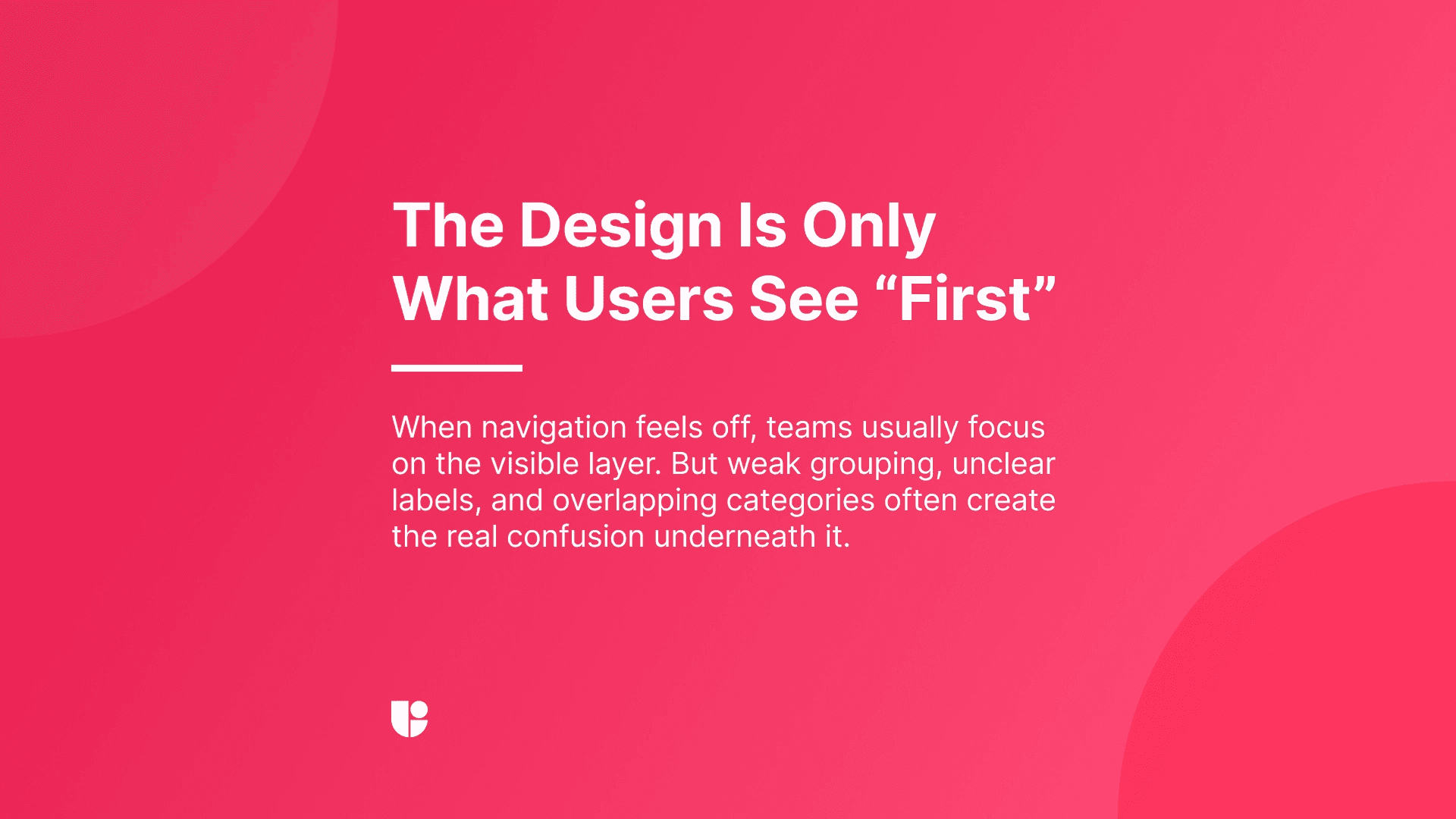
When teams decide their navigation needs work, they usually start with the menu. The labels feel off, the header looks crowded, or the dropdown seems harder to scan than it should be. Those are valid design concerns, but they only describe the visible layer. A weak menu is often just the symptom. The real issue may be the structure, the labels, the grouping, or the lack of research behind the redesign.
You don’t always have to start with a “problem” to update your navigation or menu, sometimes you just want to make sure you are still aligned with the expectations of your users and other times, you might want to add new items in just the right place with user insights. We are in the middle of reviewing our menu structure at Useberry now, which is probably why the distinction feels especially relevant to me.
Once you start reviewing card sorting results, discussing what users struggle to find, hearing marketing’s view on what the product needs to communicate more clearly, and balancing all of that with what is feasible in the design, you quickly realize that the menu is only one expression of a much bigger system.
The menu is the interface. IA is the logic underneath it.
A menu is where users see the structure. Information architecture is how that structure is built.
When I think about IA, I am thinking about grouping, hierarchy, naming, and the relationship between different parts of the product or site. I am thinking about whether the system reflects how users expect information to be organized, not just whether the links look neat on a screen.
That distinction becomes obvious once a team starts redesigning navigation. A cleaner menu can still sit on top of categories that overlap, labels that only make sense internally, or paths that force users to stop and think. The UI improves, but logic underneath stays messy.
Why teams mix them up
The confusion is understandable. Menus are easy to see, easy to review, and easy to criticize. “Information architecture” is less visible, so it often stays hidden until users start struggling with it.
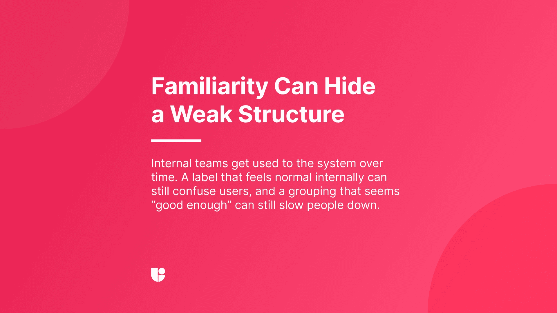
Internal teams also get used to the structure over time. A category name that felt awkward at first starts to seem normal. A grouping that is slightly off becomes familiar. The longer a team lives with a system, the easier it is to mistake familiarity for clarity. I found myself falling into the same trap and thinking, “why do we need to change that item, it worked fine so far”, during one of our recent meetings. The reason was obvious after listening to Harry’s research results.
That is why these conversations need more than design opinion alone. Marketing may be thinking about what the menu grouping tells about the product. Research may be looking at what users can actually find. Design may be trying to reduce clutter without losing meaning. They are all important perspectives that needs to work together to create the best experience. Even if there are somewhat conflicting objectives among different teams, as long as the decisions are user-centric, the end result will deliver a good experience.
What I look at before changing the menu
Before redesigning the navigation itself, I want to understand where the friction is coming from. Sometimes it is visual. A menu may be dense, uneven, or difficult to scan. Often, though, the deeper issue is structural.
The questions I come back to are fairly simple. Do users know where to start? Do the labels reflect user language or only internal language? Are we separating content clearly, or are we creating sections that compete with each other? When someone is trying to complete a task, does the path feel obvious or do they have to interpret the system first? This is just a shortlist to help me differentiate where the problem lies, within the design or logic behind the grouping.
Why navigation redesigns often disappoint
I think this is where many redesigns go wrong. Everything looks more polished, but the structure stays mostly the same. The new menu may look cleaner and feel more modern but the teams hesitate to shake up the menu too much even when necessary and stay within the safe zone. This is because they are usually doing this redesign on a hunch or anecdotal user feedback without any testing or user data to make changes confidently.
But if users still hesitate or guess where things live, the redesign has not solved the actual issue. I have seen this happen enough times in my personal experience that I no longer assume a neater menu equals a clearer experience. If the architecture is weak, better styling will not carry the whole system very far.
The research signals I trust most
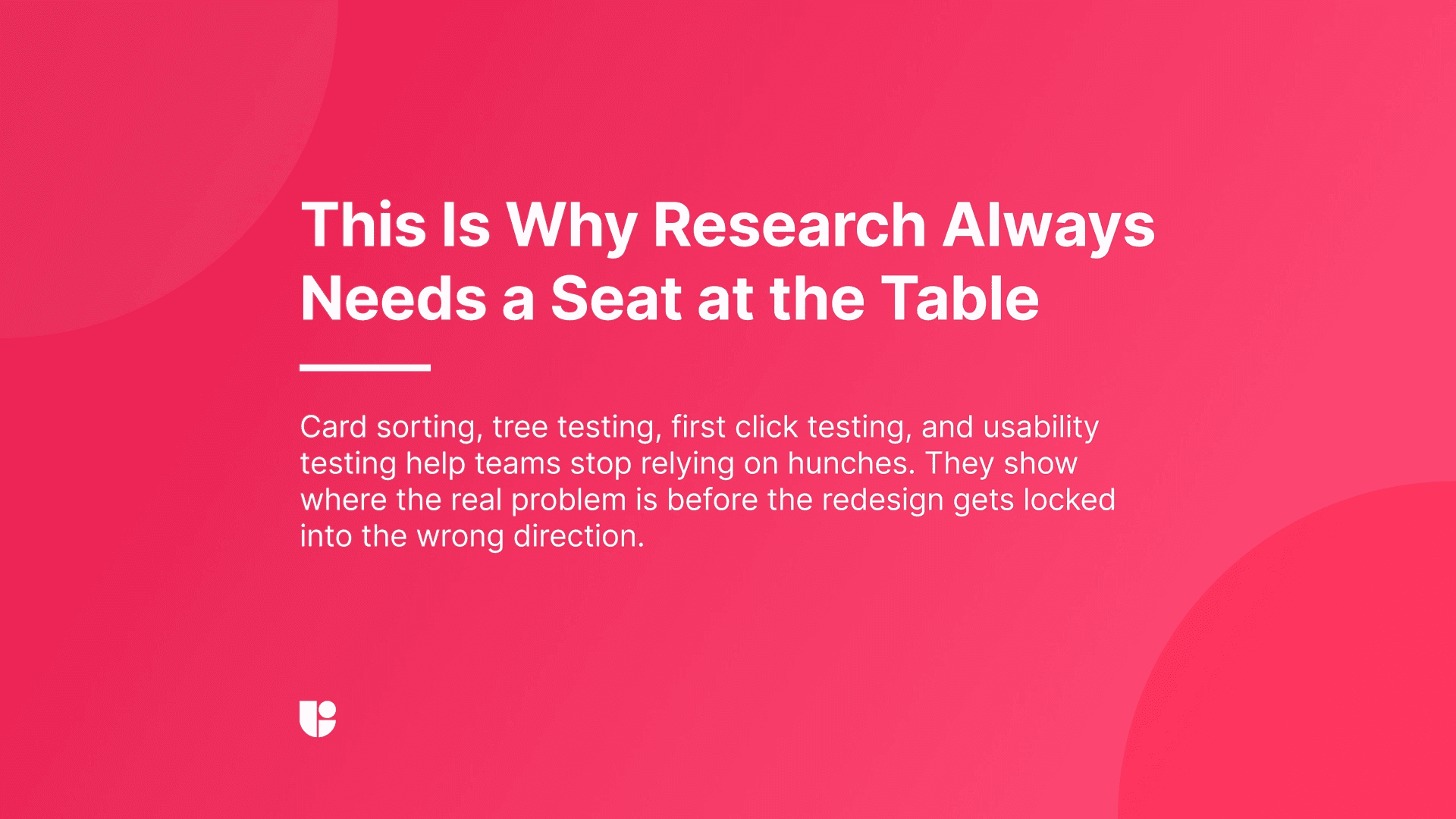
For IA work, I rely heavily on research. I do not want to make structural decisions based only on internal logic, especially when the goal is to help users find their way with less effort.
Card sorting is one of the most useful starting points because it shows how users naturally group and label information. In our own discussions, this kind of input is very grounding. It gives the team something more useful than professional or personal preference. It shows where our assumptions line up with user expectations and where they clearly do not.
Tree testing is another piece I trust. It tells me whether the structure actually works when users need to find something. Once navigation is placed inside a real UI, first click testing helps me see whether users know where to begin.
Always great to run a website usability testing on your proposed redesign to get validation and review recordings to see if users are still hesitating, backtracking, or feeling confused.
A better menu usually starts earlier
Good navigation work starts before the menu is polished. It begins when the team is still open to changing the structure, questioning the labels, and adjusting the grouping.
That is also where the real tradeoffs show up. Marketing may want some areas surfaced more clearly. Design may want a simpler experience with less cognitive load. Research may show that the most intuitive structure is not the one the team expected. That tension is not a problem. It is part of doing the work properly. I never hesitate to have a “professional argument”, when I know everyone involved is aligned in terms of the goals being delivering a great experience.
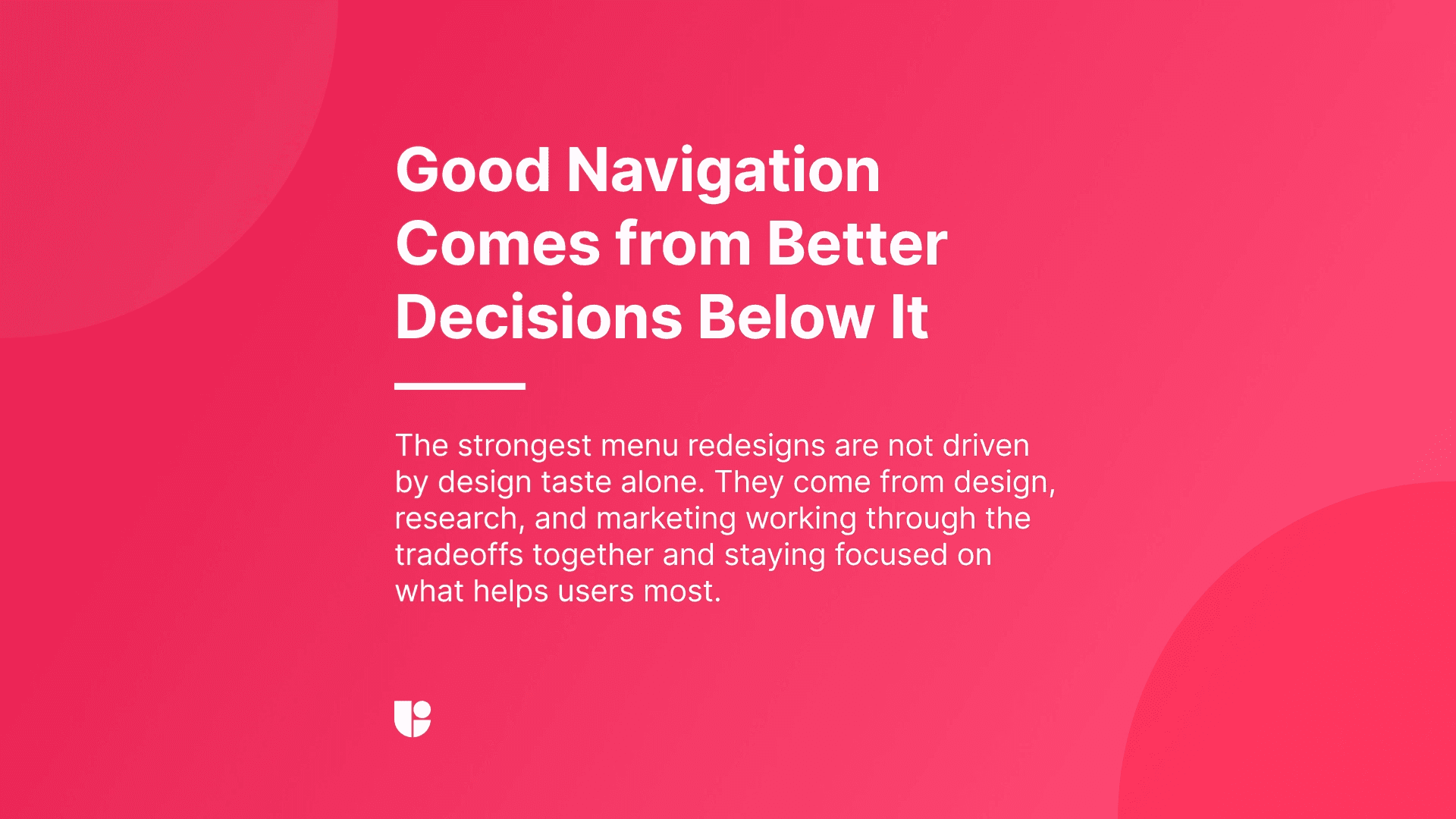
A cleaner menu is not enough
Just wanted to iterate that point one last time. A cleaner menu can absolutely improve the experience, but only if the structure underneath it is doing its job too. That is what this process keeps reminding me. Grouping, naming, hierarchy, research input, and cross-functional discussion all shape whether navigation actually feels clear to users. When those pieces are strong, the menu feels simpler for the right reasons. When they are not, the polish only covers the confusion for a while.