What a Weak Landing Page Is Usually Trying to Tell You

•
5 min read
Better landing pages start with better research questions. Learn what marketers should test before changing copy, layout, or CTA strategy.
In the previous User Testing for Marketers article, I wrote about why marketers should test campaign pages before putting budget behind them. I wanted to stay on that topic a little longer, because there is another part of the process that matters just as much.
Knowing that you should test a landing page is one thing. Knowing what you actually want to learn from that test is what makes it a lot more effective.
I have seen plenty of landing page reviews drift too quickly into edits. The headline needs to pack more “punch”. The CTA should move higher. The page needs more proof. Sometimes those instincts are right. Still, landing pages usually improve faster when the team starts asking better questions to the right people, instead of rushing revisions with internal feedback.
A landing page usually struggles before anyone knows why
When a landing page feels off, teams often describe the problem in very broad terms. It is not converting. It is not clear enough. People are not clicking. Those are real issues, but they are still symptoms.
Before changing the copy or redesigning the layout, I think it helps to ask a more useful question: what exactly do we need to learn from users before making changes?
Sometimes the problem is clarity. Sometimes it is trust. Sometimes the page asks for action too early. Sometimes users understand the offer, but they do not see why it matters to them. That is why I prefer starting with research goals instead of jumping straight into edits.
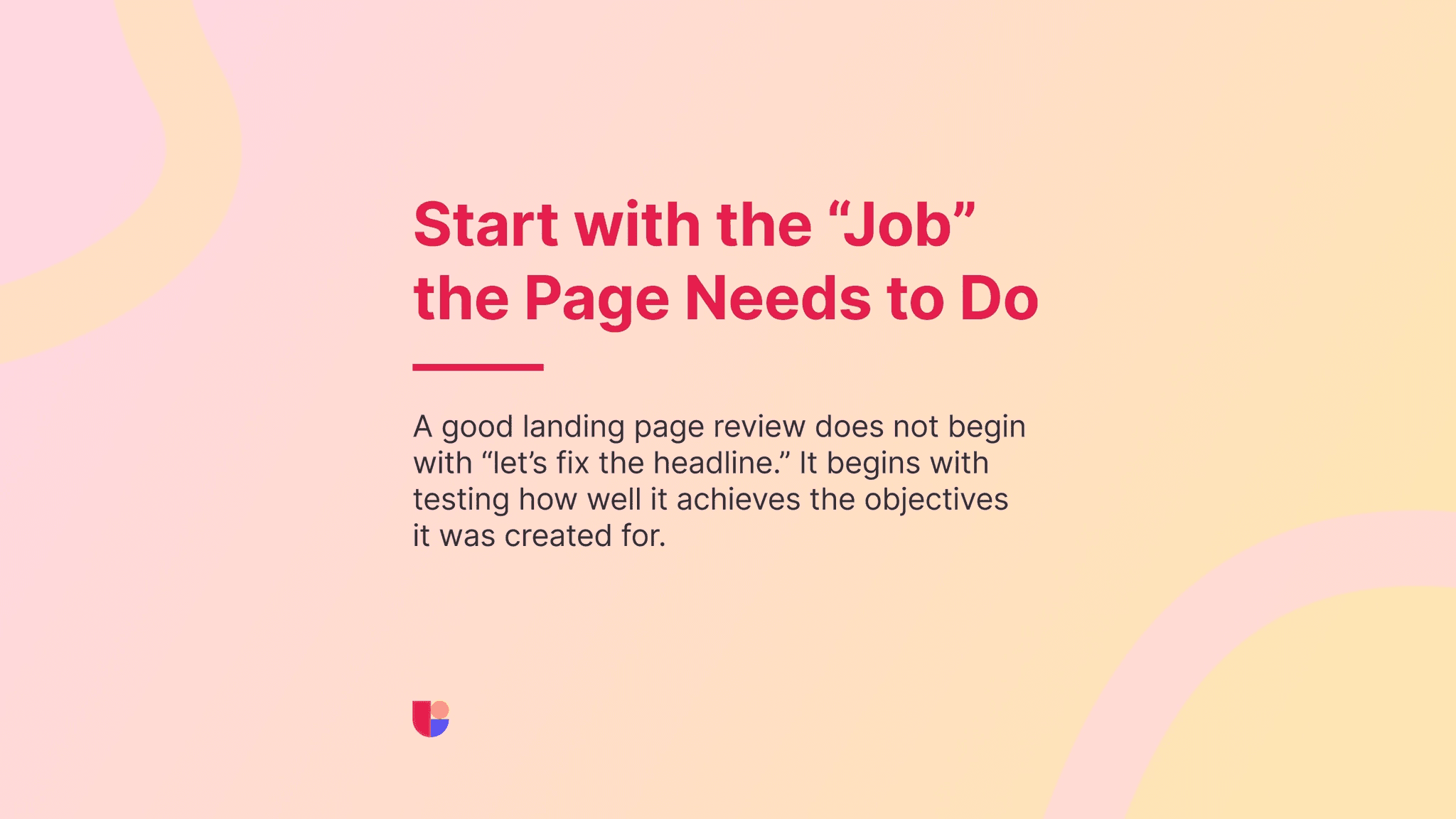
Start with the page objective, not the page elements
A good landing page test does not begin with “let’s test the headline.” It begins with the job the page is supposed to do. Is this page trying to get demo requests? Registrations? Leads for a downloadable resource? Signups for an event? Support for a limited-time campaign? Once that objective is clear, the research questions become much easier to write.
You stop testing random page elements and start testing whether the page is helping users move toward the outcome it was built for. That shift sounds small, but it changes the quality of the feedback a lot. It will also make it a lot easier to choose the right research method for your test. Preference test, Surveys, First Click Test, 5-Second Test are just some of the powerful research methods available at Useberry but they work the best when they fit your objective.
The first thing I want to know is whether the page is clear
This is usually where I would start.
A landing page can look polished and still leave users unsure about what is being offered, who it is for, or why they should care. A few questions I find especially useful here are:
Can users explain what this page is offering in their own words?
Do they understand who this page is for?
Do they know what happens if they click the CTA?
Do they notice the most important message early enough?
These are strong goals for website usability testing because they let you see where people hesitate, what they misunderstand, and whether the page gives enough context at the right time.
Then I want to know whether the page builds enough trust
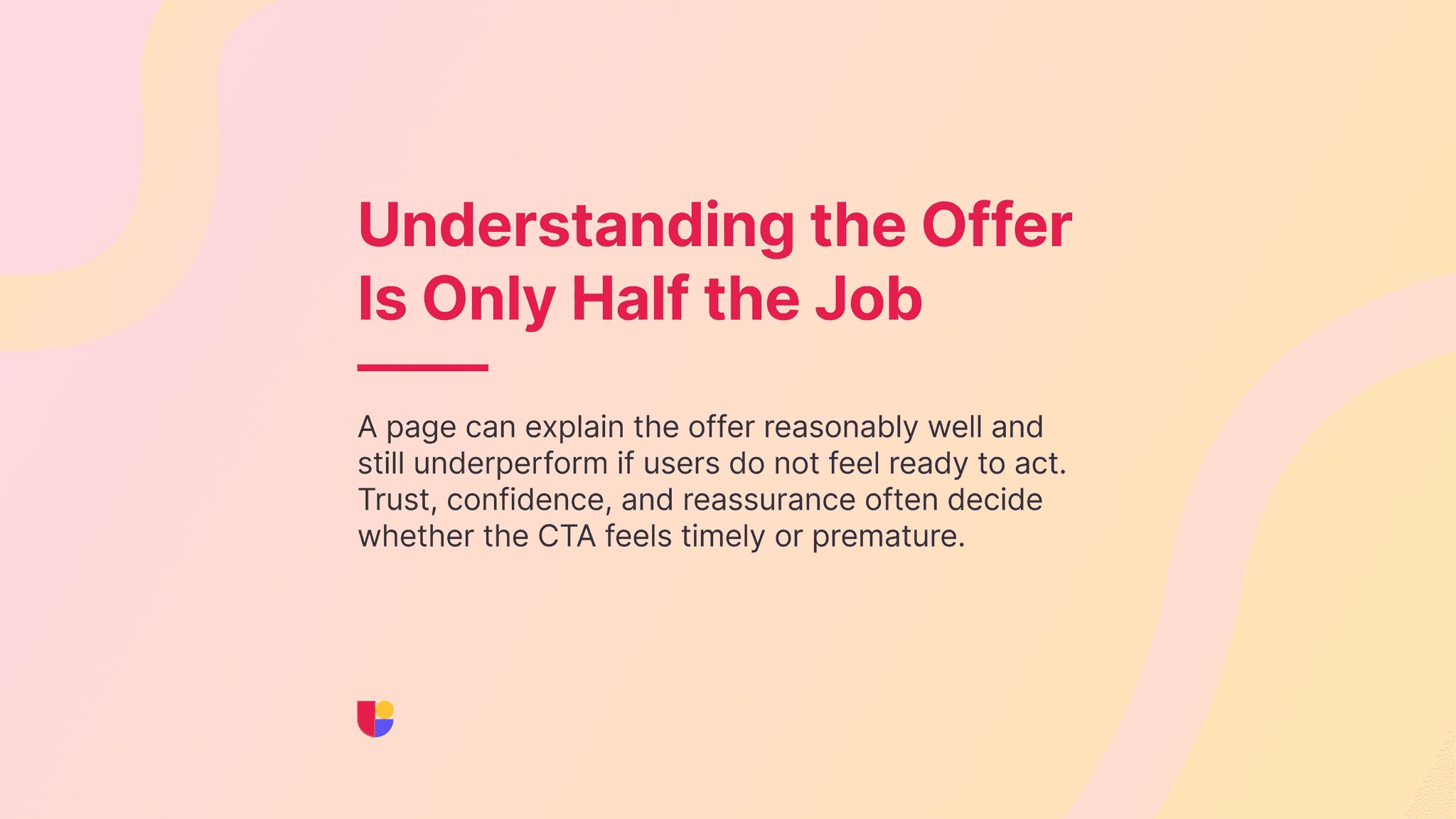
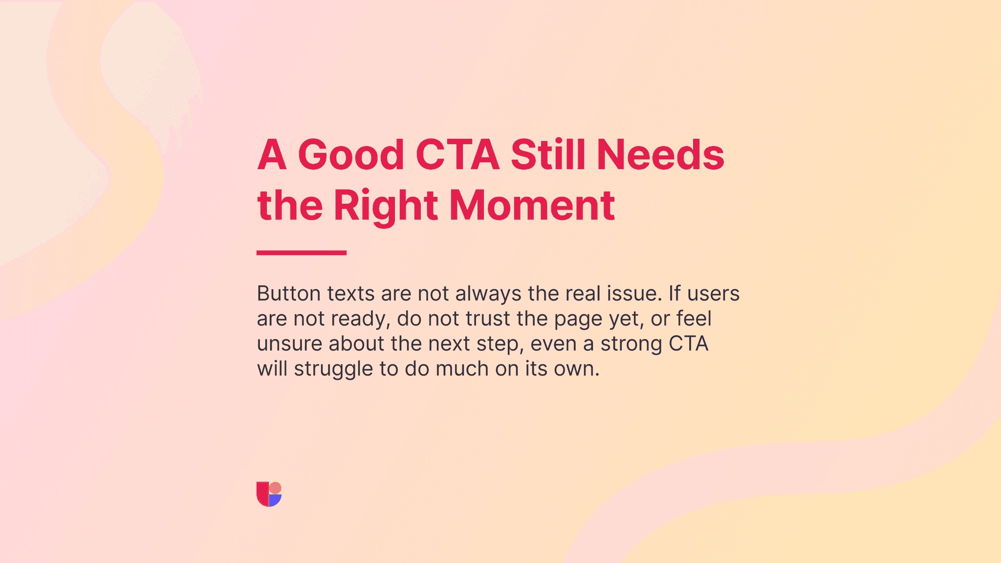
A lot of landing pages explain the offer reasonably well and still underperform because users do not feel ready to act.
This is the part I think marketers sometimes underestimate. A page does not only need to be understood. It also needs to feel credible. If the CTA appears before users have enough confidence, the issue is not always the CTA itself.
Questions we can ask after the study task could include:
Do users trust the offer enough to take action?
Is anything making them hesitate before the CTA?
Are they missing proof, detail, or reassurance they expected to see?
This is also where recordings are especially useful. You can often spot the exact moment confidence drops or hesitation happens while the user is going through your landing page.
Then I look at whether the page leads naturally to action
Some landing pages are clear and persuasive but they create friction at the point where the user is supposed to move. That is where I start looking at action more directly. Do users notice the CTA? Are they ready when they reach it? Do they understand the next step? Are there multiple elements competing for the same decision?
This is where first click testing can help, especially when the page has several possible paths. It answers a very practical question: when users are ready to do something, do they know where to click next?
Sometimes the right question is about direction
A team may not be trying to fix one page yet. They may be choosing between two directions. One version leads with the product. Another leads with the pain point. One hero section feels more direct. Another feels more emotional. In those cases, I do not think the goal should be “which one do we like more?” I would rather ask:
Which version helps users understand the offer faster?
Which one feels more relevant?
Which one builds more confidence?
That is where preference testing becomes very practical. It helps compare directions early, before the page is locked in.
Short campaigns need sharper questions
Testing gets even more important when the page is tied to a promo weekend, event signup, launch, or limited-time offer.
In those cases, the page has to start working quickly. There is usually no time after launch for “learning” and improving the page. That means the questions you bring into testing should be sharp too. You are not asking whether the page is “good.” You are asking whether it is ready.
A quick website usability test or survey before launch can be enough to catch weak points while there is still time to improve them.
Better landing pages usually come from better diagnosis
This is probably the main point I would leave marketers with.
Landing pages rarely improve because a team guessed correctly under pressure. They improve because the team understood what users were missing, where confidence dropped, what felt unclear, and what the page needed to do better before launch.
That is why I think better landing pages start with better questions. Once the research goal is clear, the testing becomes more focused, the feedback becomes more useful, and the revisions become much easier to justify.
For marketers, that makes the work much more grounded. You are not just changing the page because something feels weak. You are improving it with a better understanding of what users actually need from it.


